Probability and distributions
By the end of this module you will be able to:
- Explain normal distributions and what they tell you about data
- Describe correlation vs causation with examples
- Interpret basic statistical measures correctly
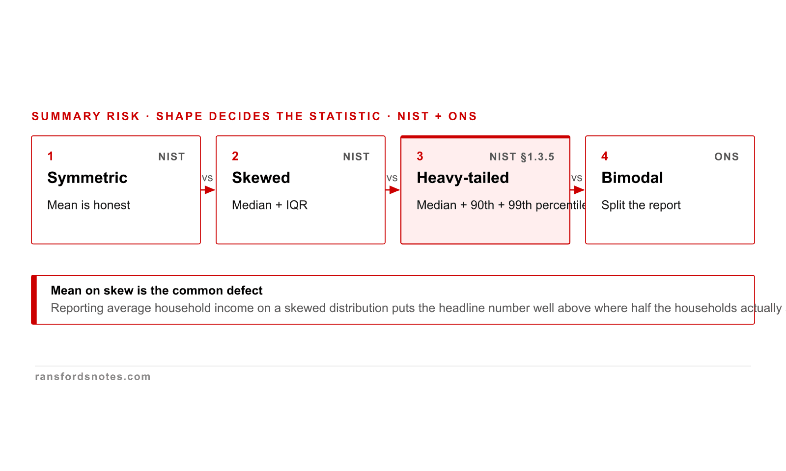
Distribution shape decides which summary statistic is honest
The honest summary statistic depends on distribution shape: symmetric, skewed, heavy-tailed, or bimodal.
The honest summary statistic depends on the distribution shape. Symmetric: mean. Skewed: median. Heavy-tailed: median plus percentiles. Bimodal: split the report. Picking the wrong summary distorts the claim; the NIST Engineering Statistics Handbook §1.3.5 lays this out.
Outlier decision path: identify, classify, handle by cause
An outlier is not a defect by default; classify the cause before handling it.
An outlier is not a defect by default. The decision path is: identify candidates, classify cause (measurement error, data-entry error, or genuine extreme), handle by the cause. NIST Engineering Statistics Handbook §7.1.6 sets the same shape; deleting genuine extremes loses the signal.
Choosing a summary statistic from audience and decision
Summary selection follows audience and decision, not the spreadsheet default.
Summary selection is a triage by audience and decision: what is the reader doing with the number? Reporting a typical value? Median. Detecting extremes? Percentiles. Comparing groups? Difference plus interval. The ASA 2016 statement makes the same point in reverse: do not pick a statistic that hides what the decision needs.
Real-world mistake · 2020
A council used average income to plan services. Half the residents were below it.
A London borough used mean household income to set eligibility thresholds for subsidised services. The mean was £38,000 per year. But the distribution was heavily right-skewed: most households earned between £20,000 and £30,000, while a small number of households in one ward earned over £200,000.
The median (£27,000) better represented the typical household. Using the mean excluded thousands of genuinely low-income households from support. Understanding distributions is not abstract mathematics; it determines who gets help.
The mean income in the area was £38,000. But the distribution was right-skewed: a few high earners pulled the average up. The median was £27,000. Which number should planners use?
Statistics is how we extract meaning from numbers. But statistical measures can mislead when applied without understanding the shape of the data. This module covers the distributions, measures, and correlations that every data practitioner needs to interpret correctly.
With the learning outcomes established, this module begins by examining distributions and shape in depth.
16.1 Distributions and shape
A distribution describes how values in a dataset are spread. The shape tells you which summary statistics are reliable. For a normal (bell-shaped) distribution, the mean is a good measure of the typical value. For a skewed distribution, the median is better because it is not distorted by extreme values.
The 68-95-99.7 rule applies to normal distributions: approximately 68% of values fall within one standard deviation of the mean, 95% within two, and 99.7% within three. Values beyond three standard deviations are outliers by convention.
“All models are wrong, but some are useful.”
George Box, 'Robustness in the Strategy of Scientific Model Building' (1979) - Opening statement
Box's observation applies directly to distributions. A normal distribution is a model. Real data is never perfectly normal. The question is whether the normal approximation is useful enough for the decisions you need to make.
Common misconception
“The average is always the best summary of a dataset.”
The mean is pulled toward extreme values. In right-skewed data (income, house prices, insurance claims), the mean overstates the typical value. The median (the middle value when data is sorted) is strong to outliers. Always check the distribution shape before choosing a summary statistic.
With an understanding of distributions and shape in place, the discussion can now turn to correlation versus causation, which builds directly on these foundations.
16.2 Correlation versus causation
Correlation measures the strength and direction of a linear relationship between two variables. The Pearson correlation coefficient (r) ranges from -1 (perfect negative) through 0 (no linear relationship) to +1 (perfect positive).
Correlation does not imply causation. Ice cream sales and drowning rates are positively correlated because both increase in summer (a confounding variable: temperature). Nicholas Cage films released per year correlated with swimming pool drowning rates from 1999 to 2009. The correlation was real; the causal relationship was not.
Establishing causation requires controlled experiments (Module 17), natural experiments, or well-designed observational studies that account for confounders.
“Correlation is not causation but it sure is a hint.”
Edward Tufte - Attributed
Tufte's wry observation captures the practical tension: correlations are worth investigating, but acting on them without understanding the mechanism is dangerous. A correlation between marketing spend and revenue hints at causation but does not prove it until confounders are controlled.
Common misconception
“A correlation of 0.95 means one variable causes the other.”
A correlation of 0.95 means there is a strong linear relationship. But the relationship may be driven by a confounding variable (temperature drives both ice cream sales and drowning rates), reverse causation (revenue causes marketing spend increases, not vice versa), or coincidence (spurious correlations). Causation requires a plausible mechanism and controlled evidence.
A dataset of house prices in London has a mean of £620,000 and a median of £415,000. What does this tell you about the distribution?
A study finds a correlation of r = 0.87 between a country's chocolate consumption per capita and the number of Nobel laureates it has produced. What can you conclude?
A manager says: '95% of our customers are satisfied because the average satisfaction score is 4.2 out of 5.' What statistical error is this?
A marketing team reports that ice cream sales and drowning incidents are strongly positively correlated (r = 0.87). They conclude that ice cream causes drowning. What statistical fallacy is this?
Key takeaways
- Distribution shape determines which summary statistics are reliable. For normal distributions, the mean works well. For skewed distributions, the median better represents the typical value.
- The 68-95-99.7 rule applies to normal distributions: 68% of values within one standard deviation, 95% within two, 99.7% within three.
- Correlation measures linear relationship strength (-1 to +1) but does not establish causation. Confounders, reverse causation, and coincidence must be ruled out before acting on a correlation.
- Always visualise the distribution before computing summary statistics. A mean of 4.2 out of 5 does not tell you what percentage of respondents are satisfied; only the distribution does.
Standards and sources cited in this module
Box, G.E.P. (1979). 'Robustness in the Strategy of Scientific Model Building'
Opening statement
Source for 'all models are wrong, but some are useful.' Applied to distribution assumptions throughout this module.
Full article
Famous spurious correlation demonstration. Used as the quiz example of correlation vs causation.
Tukey, J.W. (1977). Exploratory Data Analysis
Chapters 1-3
Foundational text on examining distributions before computing statistics. Introduced the box plot and emphasised data shape.
DAMA-DMBOK2 (2017)
Chapter 14, Data Science and Analytics
Industry framework for statistical analysis capability within data management.
Module 16 of 26 · Applied Data